For around six months I’ve had an idea in my head for a new painting in my house and finally, I’ve done it. This time I tried something completely new in terms of technique, and inspired by my partner in OTLP, Greta @ Topography.
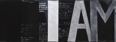
An art history student way back when, I particularly love modern art and some of my favourite pieces are ones by Toulouse-Lautrec and New Zealander Colin McCahon which use hand drawn or stencilled words. I don’t necesarily like political messages, but more the forms of words and the use of them as creative expressions of the brush themselves. As a journalist by trade, I have a thing for words.
So therefore it's pretty logical that I adore the new fashion trend of using Typography in interior design fabrics, nursery fabrics, and on canvas art works, particularly in black and white.
I wanted to do something totally unqiue to our family though, so armed with a piece of graph paper, I came up with a combination of words and numerals important to my New Zealand childhood and my husband’s Australian childhood. Using the graph paper squares, I spaced them according to the different widths needed for different sized fonts and then hit the craft shops looking for stencils to fit. I also bought some scrapbooking letters, to use as a stamp when wiped generously with oil paint.


Miss Four and I painted the canvas black, and then used white oil paint through the stencils and on the back of the scrapbooking letters, as stamps. I actually love how it came out partly looking hand-drawn and partly like place name signs. Alongside my extra large size canvas I did a few years ago featuring flax and toi toi, and my new fantail cushion, and my treasured Aboriginal bird painting, I feel like I’ve ‘Anzac-ified’ my house appropriately.
 What do you think? Might pop it into the Creative Collective's January challenge to try a new craft and share it...


