This is default featured slide 1 title

Go to Blogger edit html and find these sentences.Now replace these sentences with your own descriptions..

This is default featured slide 2 title

Go to Blogger edit html and find these sentences.Now replace these sentences with your own descriptions..

This is default featured slide 3 title

Go to Blogger edit html and find these sentences.Now replace these sentences with your own descriptions..

This is default featured slide 4 title

Go to Blogger edit html and find these sentences.Now replace these sentences with your own descriptions..

This is default featured slide 5 title

Go to Blogger edit html and find these sentences.Now replace these sentences with your own descriptions..

Search This Blog

Showing posts with label wall art. Show all posts

Wednesday, August 31, 2011

Sunshine in the Mail


Mail swaps can be stressful (as I found out when I overcommitted myself last Christmas!) but this week I received a gorgeous present thanks to Seaweed and Raine's stress-free 'Sunshine in the Mail' swap. My package *all the way from Australia* was so big that I clearly needed help opening it.


The swap was a blind one so I didn't know where it was coming from - what a lovely surprise to be spoiled by designed-to-a-t. This beautiful handmade bag was snapped up by Miss 4 as it perfectly fits her new favourite toy, but I am keeping the matching card with sewn-on ric rac (don't you love ric rac!)


This sweet poster came complete with clipboard for displaying!
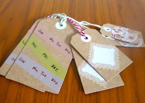

And these pretty tags are a welcome addition to my stationery stash (do you think that is washi tape? I  need to try some...) It really was a lovely package, thank you so much Terese   :)


I sent my swap package off a couple of weeks ago because it had to go all the way to New York! I made the rosette brooch from lily pad scraps and sent some stationery from New Zealand designers...


I hope Lissa enjoys them, you can see her lovely drawings and photos on her blog A Chance of Sunshine. If you have ever thought about entering a swap, keep an eye out for an easy one like this and sign up!

Tuesday, August 9, 2011

New House: Room 3


So the lily pad family has moved into our new house, and the interior decorating is coming along at full speed. Room One - the lounge, is all complete apart from my own art work I'm working on, and hanging of the navy patterned wallpaper. Room Two - the girls combined room - is all complete and looks exactly like the mood board! They love it and putting them in together has made them firm little play friends too.

Room Three - is the combined kitchen and family room area. This is the area that 'sold' me the house when we came to look it at. I could picture us using this room all day, every day - and that's exactly how life is unfolding in the three weeks we have been here.
The kitchen is a light white/cream colour, with louvre servery windows above the stove and coffee nook that open out onto a breakfast bar on the deck. We use this mostly for coffee and cake so far, BBQs will come in the summer! The dining/family area wraps around the kitchen, and leads to same 'outside room' as the breakfast bar - a fully covered deck area - which lets in the sun and keeps out the rain.


The look I wanted was a holiday /weekender/ cafe style. So I've gone with a relaxed feel that mixes and matches furniture types of white lacquer and beech wood and red metal, and I really love the look of it. I've proudly purchased a couple of New Zealand artists' prints from Endemic World and Etsy in a food and drink related theme - Bron Alexander's "Daily Grind", Dear Colleen's "When Life gives you lemons, drink gin and tonic" - and my own New Zealand-themed cavases and applique cushions sit alongside. (Yes, I've yet to buy a frame for my family tree I completed on Friday. I will probably also purchase a joke 'keep calm' print about curries.)

Outside, we've gone with black wicker couches like a cruisy cafe. The sun shines in all day and friends have commented that sitting out on the deck outside feels like you've gone on holiday. I just love it! As well as the moodboard, I thought this time you might like to see the real deal.


What's next? Room 4 is our bedroom, which is changing all the time! Might have to wait a while for that one!!

Friday, August 5, 2011

Silhouette families - Post Number two!


Last week Greta posted about her gorgeous silhouette art works she'd made of her children - I just loved them to pieces.


I was going to copy her and make some of my own...but at my work at the moment, I'm learning how to use computer graphics programmes to 'clear cut' images - which means removing the background around an image of a person or object, to make it look a bit more arty on your website.


So I wondered about trying to combine the two, and with the help of Google found two tutorials that explain how to a) clear cut and b) turn into a silhouette!


At home I use paint.net (a free downloadable version of paint that is one step up, and more like photoshop) so these instructions here and here worked a treat. I would really recommend downloading paint.net if you are into graphics and creating art on the computer.


Once I had taken the photos to get the image for the silhouettes (like Greta, I took individual photos of our family against white backgrounds) I then imported the pictures into paint.net and followed the instructions. Then I googled 'family tree silhouette image' and found a couple of trees I liked the look of (make sure to choose images as big as you can, not clip art size - or they come out too pixelated), and started layering up the images on top of each other in paint.net, to create the over-all effect.


Print it on a computer and away you go!


Next I might do it again, but 'inverse' the lines into white, and print on a bright coloured piece of paper.


But I'm not sure which tree I like better - perhaps the coloured one will fit in best in the family room.


Tuesday, July 26, 2011

Silhouette Portraits


I was so inspired by a wall art project on mousehouse the other day that I couldn't wait to do something similar but personalised. After a week of mulling it over, a bird on fabric became... my kids on paper! I did it a bit different to other tutorials I have seen so here's my steps in case you want to do one too (and there's lots of other project ideas at Our Creative Spaces).


First you need some profile photos... I found bathtime was easiest for this! Because I was doing two, I wanted them similar sizes, so I just opened both pics in a Word document and played with the sizes until they were similar and fitted on an A4 page (if you are a Photoshop ninja you could of course go straight to drawing an outline but I did it old school).


I like working with stencils, so you can try again when you stuff up use them again - I keep food boxes to use for this as they are nice light cardboard, just paste your printed photos (from your A4 Word document) on to the cardboard and when the paste is dry carefully cut out the heads (I changed some details with ballpoint pen first, like giving them necks!)

Then decide which way you want them facing, I wanted the finished pictures to look to the right, so I used the stencils pointing to the left (the photo-pasted side is facing down). Trace around on black paper (I got some nice matte black paper from an art shop for 35c) in ballpoint, add a soft point below each neck, then cut out carefully with small sharp scissors.


Once you have cut out the shapes, turn them over and you can play around with colour, yay! I was going to use scrapbooking paper but found this pack of mixed A4 paper on sale (wrapping paper or wallpaper would be good too). I had planned to use bright colours but Miss 4 insisted on the gold.

Then you just need to attach the black piece of paper - paste might make wrinkles so doublesided tape or a glue-snail is easiest.


Because I did two pictures on an A4 to start with, each one now fits nicely on to an A4 backing, and A4 frames can be cheaper to buy than other sizes (sometimes they are called certificate or display frames). 

Other wall art posts we have done...

Wednesday, March 30, 2011

Baby blue - Star Wars style


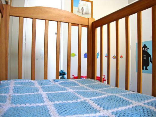
Baby boy is not such a baby any more, but his robot room is finally taking shape.


The colours came from these Star Wars posters. The Episode I poster on the left I found already framed years ago in a Rendells clearance (oh how I miss thee Rendells!), the Clone Wars cinema banner was a gift from my brother while I was pregnant.


By coincidence, my Nana crocheted this baby blanket that ties in perfectly (it is his favourite thing in the world, he loves putting his fingers through the holes).


My mum made the curtains from some clearance fabric she found that is in binary! Love it.


(She also made this gorgeous quilt, I have posted about it before here)


This amazing robot mobile was made by some other clever family members of mine, along with some matching letters for the bedroom door.


The scooter was a Christmas present from another Uncle and Aunt, it isn't from space but it does have a sparkly seat (and he is really good at riding it backwards).


I found these mini Star Wars prints (on the left) by Xander at Kraftbomb, and Aimee gave us this awesome Moon Mum robot (on the right, from Holly Chic) which I have framed with a robot poem that cracks big sister and him up.


If you are wondering what else I have made for the room myself.... um.... there are some cushions coming... and Teddy is wearing one of my prototype alphabet t-shirts. Darth Tater is currently the only toy memorabilia from Dad's Star Wars collection that is allowed to be toddler-mauled (note one arm is already missing).

See what everyone else has been doing each week at kootoyoo.com's 'My Creative Space'.


P.s. The other OTLP bedrooms so far:


Wednesday, March 23, 2011

My Creative Space - Abstract on Turquoise


My very neutral lounge needed some colour.


The only colour it had was this board Aimee made me last year and this A Little Vintage cushion I love. So I was inspired to use turquoise, white, black and red.

This square canvas had been intended as a nursery project for my son, abandoned when I found something better than I could ever draw! It is nice and big, 61cm x 61cm.


I chose a testpot for the base colour (Resene Endorphin) - I love testpots because you can get amazing colours and the paint is so nice to paint with, runny but with great coverage. There was enough for two coats (and two brushes, thank you Miss 4), which easily blocked out the really dark paint underneath.


After the base was dry, we did a white layer (just in art acrylic paint), which I left to dry so that it wouldn't turn pink and grey with the next colours. My 'vision' was a messy corner/L-shape, with which my helper concurred.


I had a black testpot already and an amazing new red (Resene Rocket).  Miss chose to use the black brush, so I did the red and we finished it off. It looks even better than I was hoping for, bright and fresh, and reminds me of Japanese writing characters. After a varnish layer only one question remains, which way up?

Every Thursday 'My Creative Space' is at www.kootoyoo.com

Tuesday, March 22, 2011

Wordless Wednesday

Friday, March 11, 2011

I'm grateful for... organisers!

The other week I fell in love with this Sarah McNeil print, and then a few days later it popped up on a Facebook auction for Christchurch, run by Foxes! So yesterday it arrived in my mailbox...

Not only does it have a 'favourite things' feel to it (I can't resist lambs and strawberries), but I love the title - 'Trying to Be Happy Most of the Time'.


I am grateful for people who set something up so the rest of us feel like we are making a contribution. Auctions (and bake sales!) make both the donator and the buyer feel good about helping, so thank you to everyone that is organising these fundraisers. If you haven't had a look at Li'l Magoolie's auction yet, it is a gorgeous collection of products for mums and kids (you will have to fight me for this hat!)


Aimee and I have each donated special sets for this auction - lilypad + (very smart) cafe face washers or navy + black newborn Kiwi shirts. Organiser Maddie is a Christchurch resident and passionate about her adopted hometown, so please take a minute to check it out.

Another organiser I'm grateful for this week - Leonie (aka kiwiatheart) who has started Softies for Christchurch. I have had a lot of fun designing my first fabric softie (pics to follow next week), and am so pleased that it will be given to a child that will really appreciate it. There is no cut-off date yet so if you would like to make one just email Leonie.

FeltAid has started up again too, their shop is here for more handmade goodies with all sales going to Red Cross.


Maxabella organises 'I'm grateful for...' on Saturdays, thanks Maxabella! 


Sunday, January 23, 2011

Anzac-ifying my house...typography style


For around six months I’ve had an idea in my head for a new painting in my house and finally, I’ve done it. This time I tried something completely new in terms of technique, and inspired by my partner in OTLP, Greta @ Topography.

An art history student way back when, I particularly love modern art and some of my favourite pieces are ones by Toulouse-Lautrec and New Zealander Colin McCahon which use hand drawn or stencilled words. I don’t necesarily like political messages, but more the forms of words and the use of them as creative expressions of the brush themselves. As a journalist by trade, I have a thing for words.

So therefore it's pretty logical that I adore the new fashion trend of using Typography in interior design fabrics, nursery fabrics, and on canvas art works, particularly in black and white.
I wanted to do something totally unqiue to our family though, so armed with a piece of graph paper, I came up with a combination of words and numerals important to my New Zealand childhood and my husband’s Australian childhood. Using the graph paper squares, I spaced them according to the different widths needed for different sized fonts and then hit the craft shops looking for stencils to fit. I also bought some scrapbooking letters, to use as a stamp when wiped generously with oil paint.

Miss Four and I painted the canvas black, and then used white oil paint through the stencils and on the back of the scrapbooking letters, as stamps. I actually love how it came out partly looking hand-drawn and partly like place name signs. Alongside my extra large size canvas I did a few years ago featuring flax and toi toi, and my new fantail cushion, and my treasured Aboriginal bird painting, I feel like I’ve ‘Anzac-ified’ my house appropriately.

What do you think? Might pop it into the Creative Collective's January challenge to try a new craft and share it...

Monday, November 8, 2010

Where to find - Alphabet Posters!

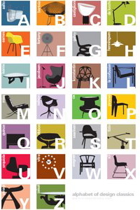
You can tell from my label Topography that I am obsessed with letters and the alphabet, so my current mission for an alphabet poster will come as no surprise!

We recently moved house so I have lots of blank walls to figure out including two children's rooms and a lounge that needs some colour... I think alphabets as clever as these ones would also work in a 'grown-ups' space.


These are my favourites at the moment (clockwise from top left):

If you have any other suggestions please let me know!